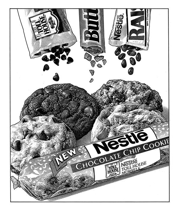
Pen & Ink Stipple Illustration for Nestlé
I've noticed this ad for Baskin Robbins all over the Internet recently. Of course the first thing that comes to mind is how much I'd like to take a break from the drawing board and run to my nearest BR store...which I'm not going to do...well okay, maybe I will...But mostly - the image reminds me of a pen & ink illustration I created back in the early '90s for Nestlé which similarly featured falling candy pieces. Pulling the reference photography together was a bit more organic back then without computer-generated aid. You can probably guess that we actually shot the wrappers and candy bits on a flat white surface and all I had to do was eliminate the shadowing to simulate everything in mid-air. I also drew all of the lettering by hand which also seems a bit antiquated today. I sure did enjoy this project. Sort of makes me hungry for a cookie...which I'm not going to go bake...well okay, maybe I will...


